How Learning Color Science Can Transform Your Work
To provide filmmakers confidence in choosing the right tools and actions for creative success, this two-part article investigates the science behind lighting for color reproduction, a contentious topic for filmmakers and photographers. How does human vision impact our lighting decisions for photography, and what can we do to trust our eyes to make these decisions?
Both questions require unpacking fundamental photographic color reproduction concepts. First we will discuss human vision in this article, and in the next article, we will deep dive into camera vision. In both parts, we’ll present practical tools and techniques to regain confidence in using your eyes for common set lighting tasks.
But, why would anyone need to “regain” confidence? This notion implies the following context: anyone working at length in motion picture lighting naturally develops a greater sense of trust in one’s “eye”—ie, one’s direct view of the lighting set—to produce a desired image in camera. I personally know countless cinematographers and chief lighting technicians who tout this skill as a badge of honor, and use the mantra “Trust your eyes!” emphatically rings in younger filmmakers’ ears.
However, lighting and technology often conspire to trick the brain into seeing one color on set but discovering a completely different color in post-production. This issue impacts even the most seasoned professionals and can cost thousands of dollars per day in color grading suites to fix. Or, even worse, this issue may manifest in a live broadcast with no immediate solution. So, we must learn foundational concepts behind human color perception and when to trust, and when to distrust, our direct vision.
Why Do My Eyes Disagree With My Camera?
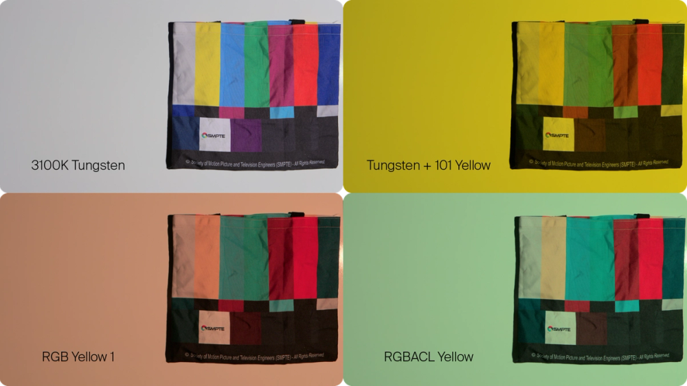
Figure 1: This example shows an ideal yellow light on the top right, and how an RGB fixture may appear to one’s eye on set. But, cameras invariably will see it as the below left frame.
Have you ever tried to dial in a color setting into an LED fixture by eye to your taste, but encountered a completely different result in your camera monitor? Your eyes lied to you! Or, so it seemed, even after you tried your best to dial in your desired color. You may have even swapped out your RGB LED fixture for another LED technology, RGBACL, to address the problem, but still failed to dial it in. The bottom right image could have been your best option, no matter how you dialed in the emitters.
Unfortunately, the only answer ended up being the traditional method: setting the LED fixture to full spectrum 3100K and filtering it with a 101 Yellow lighting gel. What happened to the promise of RGB LEDs to dial in any color on a whim? Why did this happen, and what can be done to solve this issue? To explore this topic, let’s start with this idea:
Colors aren’t colors… until they’re colors
Yes, this contradictory thought seems counterintuitive, but we must grapple with the concept of color perception: colors exist only in our heads as psychological concepts:
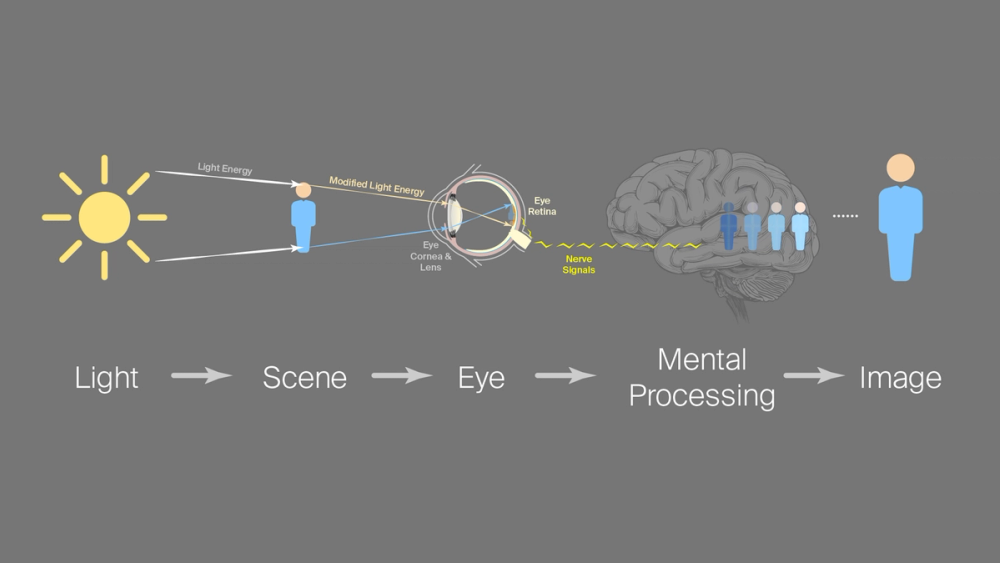
Figure 2: Color perception information pathway
The physical reality that we perceive as “color” is, merely, physical light energy bouncing around the world before entering our eyes. Once the light energy enters our eyes and shines on their retinas (the internal lining), specialized cells convert it into nerve signals.
The brain’s vision center processes these converted nerve signals, not the light energy itself, into the mental constructs we call “images”. Only at this junction does the concept of color exist. Within this highly fluid mental state, our perception of an unchanging lighting reality can drastically change due to our moods, adapting over time or space, or any other extenuating circumstance. Our eyes—or rather, our brains—can lie to us if anything hacks any part of that signal chain. Let’s try an example of “hacking” the brain with an illustration of the “Bezold Effect”. Consider this red line:

Figure 2a: A red line
Anyone reading this article should see a line of a saturated red hue. Now, if I also add a green line and a blue line of beside it and shrink the width as much as possible, we get the following image:

Figure 2b: RGB strip
If we repeat this trio across a field of these lines and slip white box behind the red and green lines, to what color does the white box appear to change?
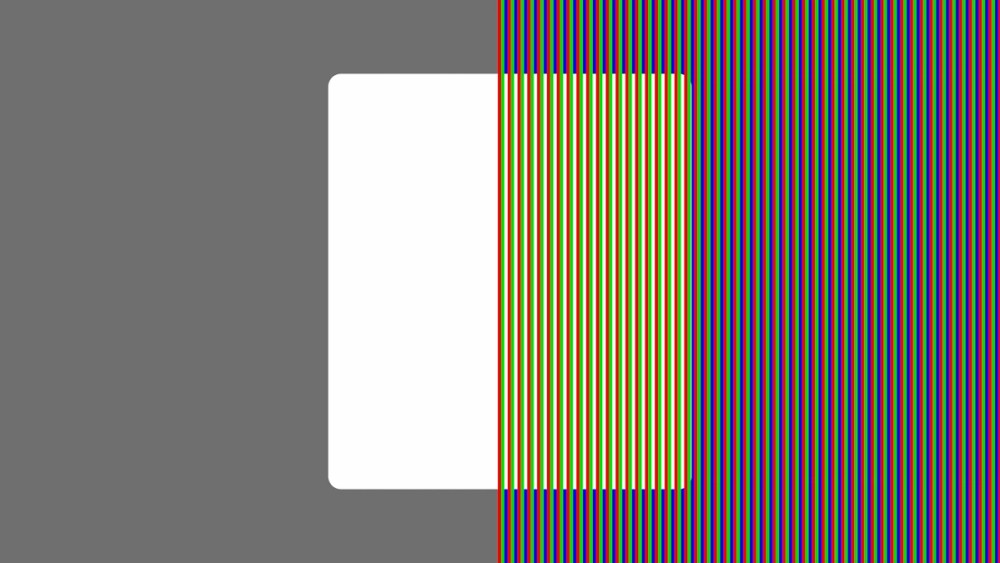
Figure 3: Von Bezold effect video illustration
The box will most likely appear yellow to anyone reading this article. But, if one zooms in on the image, it’s easy to see that the box is still white, not yellow:
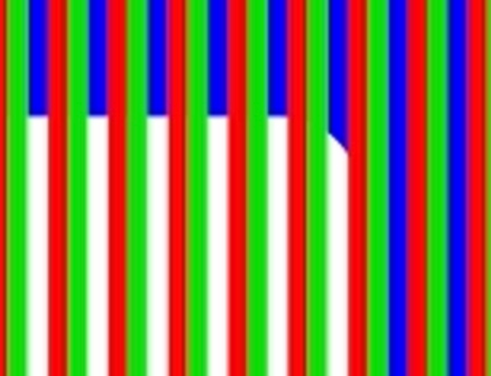
Figure 4: Bezold effect magnification
Physical reality hasn’t changed, just our mental processing! Optical illusions like this hack the color perception process to reveal that colors are purely ideas constructed from our eyes’ interpretation of the world.
Color Perception Concepts to Inform Color Decisions
The Bezold effect introduces the reality of color existing only as a fluid idea. Our eyes can therefore deceive us while lighting our production sets and actors for photography, so we propose learning these principles to regain trust in our direct vision:
- Adaption: Eyes always adapt to the visual context.
- Physics: Eyes throw out light physics information. This allows for color reproduction technology to work, but also causes color confusion when lighting scenes for photography and cinematography.
- Multiple Observers: Eyes differ between observers: people are not cameras, cameras differ between each other, and yet, somehow, we must try to all process similar information.
Understanding and directly applying these principles will transform the way one thinks about color intention, lighting color design, and most importantly, when color decisions should take place in camera or in post-production color grading.
How Adaptation Informs Color Decisions
Since we now have established that color vision purely exists as an idea, unsurprisingly, we must understand that our idea of color adapts instantly and constantly in space over time. The context in either dimension influences our processing and therefore our idea of color.
Color in space: spatial adaptation
Our brains always adapt our ideas of color based upon the spatial arrangement of color in our vision. Take this diagram in Figure 5—in the center of the larger violet and light green squares, the smaller green squares appear to have different brightness values:

Figure 5: Josef Albers color constancy video illustration
But when I remove the center green and magenta strips, it becomes more obvious that it’s the same green strip all along. Our brains used the immediately placed bright green and magenta strips to color our perception of those central squares. And, as a reminder from Figure 4, since the immediate context of red and blue stripes surround the white stripes near the limit of our eye’s resolution, our brains use this spatial information to fill in the less intense information (white) in between:
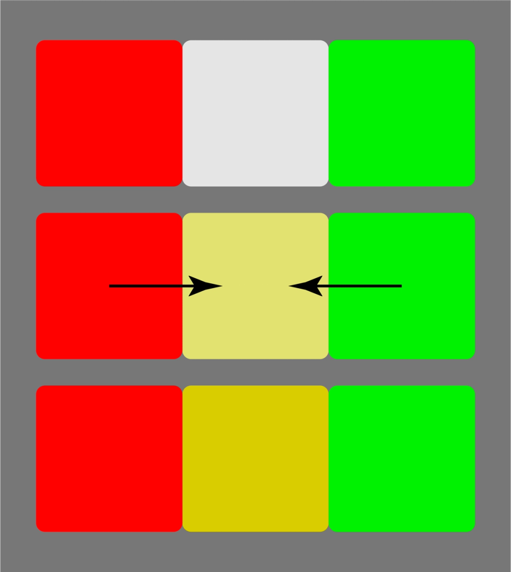
Figure 6: Spatial adaptation – how the brain “fills” in the gap to turn white into yellow in the Bezold effect example from Figure 3
These sort of color adaptation examples abound in Josef Albers’ seminal text on the subject entitled, Interaction of Color. (A wonderfully interactive resource by the original publisher lives here, while the original format in its full, two volume interactive glory can be found here at a hefty price. Any visual medium artist will find the small fee worth it for the online interactive version.)
While lighting a set, it’s now easy to understand how spatial context impacts perception of color within our compositions. Our perception of hue, saturation, and value doesn’t just hinge upon the direct object itself; it largely depends upon the context and environment physically surrounding an object, in addition to its inherent qualities as discussed above and in Interaction of Color. For example, consider figure 7 as a simulation of two STORM 1000Cs illuminating a white wall in an otherwise unlit light-proof soundstage. Setting one side to CCT 5600K with no saturation, and the other to 100% saturation at Hue 0°, one would see the following:
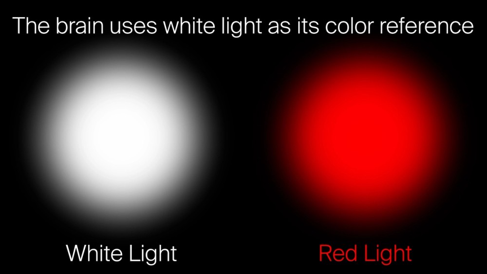
Figure 7: Spatial adaption of saturated red light video illustration
Clearly, the STORM 1000C appears saturated red to the eye and to cameras. But when one turns off the 5600K source, to most human eyes, the red often immediately appears to shift slightly orange in hue without having changed hue in reality. This image simulates how our idea of the red changes, but cameras will still see the red as red. The human brain needs to see that white or neutral reference to retain a consistent perception of hue, saturation, and value. Understanding the reality of this automatic spatial adjustment will greatly reduce color confusion on set.
Color across time: temporal adaptation
The persistence of color vision over time also drastically impacts our perception. The concept of temporal adaptation consists of the eyes’ perception of a single color adapting over time, and inability to adjust accordingly to quick changes. The visual receptors in our eyes biochemically react to light energy, so unlike camera sensors, these chemical responses take time to adjust to sudden changes in light energy. For example, if you stare at the black rectangle in the center of this red patch, do you see a slightly blue patch after it changes color?

Figure 8: Temporal adaptation
In reality, it’s a gray patch. If you briefly close your eyes and look again, it definitely appears gray!
When we are lighting on set, these issues immediately manifest as we start dialing in “white light” on our sets. If we have a lot of cool or blue tones in a scene, we may end up biasing our lights warmer than we realize until we look at the monitor. Then, we end up wasting precious time on set dialing back the color to what we really want. Although set lighting tools in controls and color tunability have made these changes easier, every moment still counts in hectic production schedules.
What can filmmakers do to reclaim this lost time and confusion to visual adaptation? For both spatial and temporal contexts, it helps to have a visual ground on set. For example, let’s take the time adaptation example again. I placed neutral gray text in the center. If one focuses on the words, there is a moment after the switch where the eye balances out the area around the letters towards red, and overall, the field more quickly reverts from cyan or blue back to neutral gray:

Figure 9: Visual ground video illustration
Just like electrical grounds allow devices and electricity to have a stable foundation for power, a visual ground simply means keeping a neutral color of significant size nearby to stabilize the eye’s and brain’s reference for white light; it provides meaningful context to appropriately judge colors. I’m not suggesting to put it within the frame itself; it helps to have a neutral gray card, or white object, lit according to your camera’s white point setting, nearby on set or by the monitor to provide an appropriate neutral perspective on your work. In color grading suites, this practice takes place already in properly built out coloring suites; a properly built facility will have neutral gray-painted walls surrounding the projection screen or reference monitor (if not the entire room and ceiling), and these walls will be lit with a white light calibrated to the color of “CIE D65” - an international standard of daylight at CCT: 6504K, duv: 0.0032. Without this, general color balance can easily start to drift in color grading a project as a session progresses.
On-location or in-studio settings, this visual ground could simply be having a small white index card, or the day’s sides, lit with an MC Pro set to the CCT and +/-G setting that gives that card a neutral white value within your camera. It doesn’t have to always be on, but it’s something handy to have up during pre-lighting a scene. Or, it could simply be your key light itself; if you’ve already dialed it in as neutral white within your camera, you can place a gray card at talent position or have a stand-in wear a gray shirt, then light the rest of your scene with that reference.
In all of these instances, for confidence in the decisions you want to make without surprises in camera, having that small unmoving white or gray object lit to your camera’s reference white balance setting will ground your vision in physical space and over time.
How Physics Informs Color Decisions
Now, we will discuss how the physical composition of light impacts our vision and defines the actual colors on set and in camera. In the process of generating visual information for our brains, our eyes throw out lighting physics information, so we need to know our technical medium to use it creatively.
The yellow light conundrum: when reality breaks theory
As a concrete example, take this camera test lit by incandescent light:
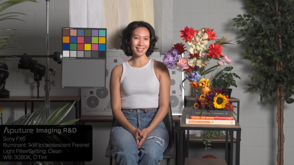
Figure 10: Camera test trial under incandescent lighting - we need this image as a reference to compare the other trials
Once filtered by a 101 Yellow gel added to a 1000W tungsten lighting fixture, it appeared to the human eye as follows:
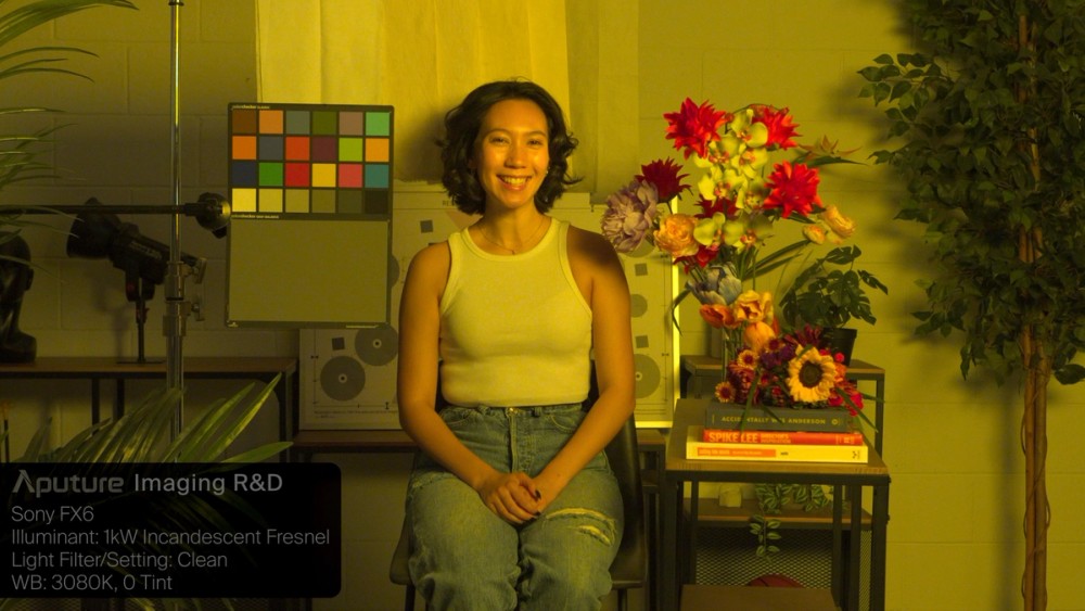
Figure 11: Camera test trial under incandescent lighting filtered through a 101 Yellow gel
So, now that we’ve established an expectation of “Yellow Light”, what if I used an LED fixture instead that promises the same color of yellow?
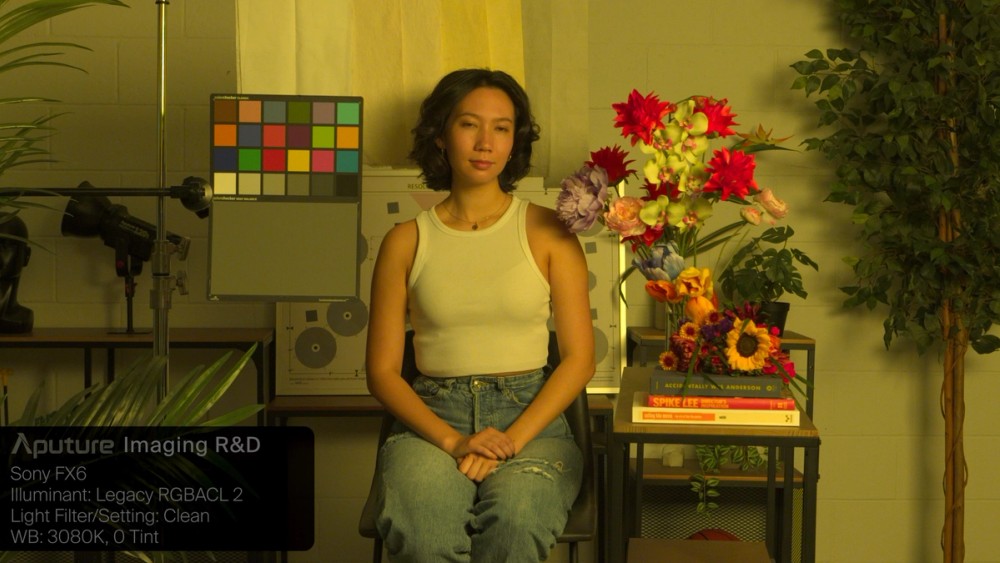
Figure 12: Camera test trial of RGBACL LED attempting “Yellow”
I didn’t expect this half saturated camera result at all, when it seemed saturated yellow in person! For this given hue, the fixture’s “100% saturation” setting didn’t produce a fully saturated yellow camera response. Even if I tried to adjust the hue, either direction of immediate hue changes didn’t give me quite what I had in the reference yellow:
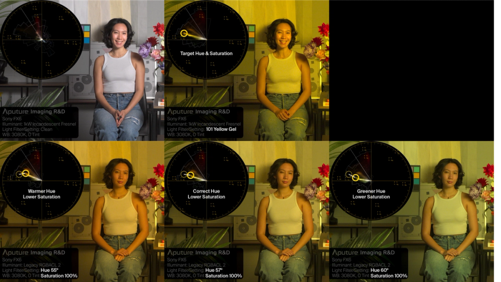
Figure 13: Legacy RGBACL fixture LED adjustments cannot achieve “Yellow”
Solve the yellow light conundrum with physics
To explain this conundrum, we must understand the light spectrum of true “101 yellow” filtration on incandescent light. But, why should we even care about this yellow light spectrum? Shouldn’t the color we see be enough?
Learning the following two concepts at a gut level will transform your craft:
- Light is energy
- Objects modify light energy
Since we now understand that color is a psychological construct, describing light in terms of this abstracted construct alone does not explain what happens when two different energy signatures fool the human brain to see the same color. In this case above, the different color results in camera illustrate the impact of different spectrum tricking the brain to see the same yellow. Real “101 yellow” gel added to incandescent light produces the spectrum in the left pane of Figure 14. Often, in conventional RGB LED fixtures as seen in the right pane, the spectrum vastly differs and exists to trick the eye’s receptors to directly see a similar yellow, but the camera “sees” a desaturated yellow color. But if one generates a similar energy spectrum fingerprint to 101 yellow + incandescent light, both eyes and cameras will similarly respond with an appropriate yellow as seen in the central pane.
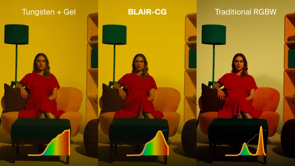
Figure 14: Matching “true” yellow spectrum with BLAIR-CG’s spectral model vs the mismatch of RGB or typical RGBACL engines
The motion picture industry’s embrace of RGB LED illumination in the 2010s brought great innovation, but also produced strange results as seen on the right. These types of color confusion still happen quite often due to the legacy technology method of merely tricking the eyes without matching the physics of saturated colors. To bring back the original camera test from Figure 11, we now can see that producing the right physics gives the right result:
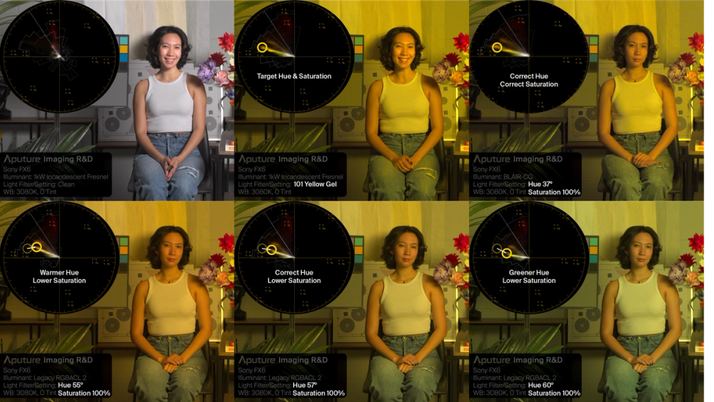
Figure 15: BLAIR-CG LED’s spectral model successfully recreates 101+incandescent “Yellow” using Hue 37° in the HSIC+ control mode
Knowledge that “light is energy” will provide your desired colors in camera
To address these very real problems, filmmakers and lighting designers must train to recognize the “good” physics they need to meet artistic expectations of color. This understanding provides the intuition and ingenuity to obtain the right cocktail of lighting sources, filtration, and physical reflective tools to deliver these good physics. In this diagram for Figure 16, each column represents the spectrum of the saturated color appearing under its reference white light at the top.
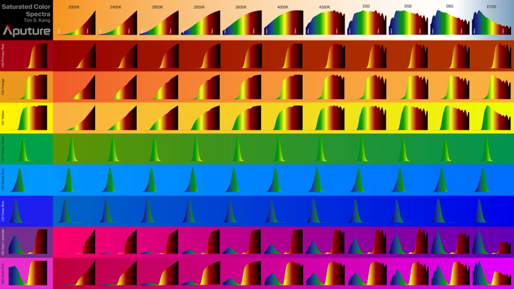
Figure 16: Each column represents the example spectral fingerprints needed to provide the saturated color in camera for the given CCT setting in camera listed at the top. For example, at 3200K, a camera “expects” the yellow spectrum in the yellow row within the 3200K column to properly map the color “yellow” for display.
LEDs rarely reproduce this dizzying array of physics to produce “correct” colors in cameras. While they can successfully trick the human visual system to “see” the desired color, cameras will often sense and display these physics as something widely different.
However, LED systems designed to meet these specific physical requirements will increase your confidence in the color results from these products. And, in lieu of these specific systems, one can devise solutions with existing tools to recreate these physics for more effective color results in camera.
In Summary
Using light to create colors for motion pictures, documentaries, broadcast, live concerts, and any other photographic scenario poses three primary challenges for the professional technician. This post discussed two of these challenges and their solutions: a) how our brains always adapt our perception of color, so we need a visual ground for our color choices, and b) how we need the right physics to produce the results we want in person and in camera.
In the next post, we will discuss the third Color Perception Concept: how understanding multiple observers informs color decisions. We shall unpack the conundrum to decide which observer matters the most to decide a color choice: a person, or a camera. This discussion involves how cameras see color in order to evaluate which answer you need for your situation.